
Colour Matters: The Psychological Impact of Your Design Choices
When it comes to creating a memorable brand, colour is one of the most powerful tools at a designer’s disposal. From the vibrant red of Coca-Cola to the calm blue of Facebook, the colours you choose for a brand can profoundly impact how it’s perceived by customers. But these choices aren’t just about aesthetics. The psychology of colour plays a crucial role in shaping emotions, perceptions, and behaviours.
The Science Behind Colour and Emotion
Colour psychology is the study of how colours influence human behaviour and emotions. This field has its roots in both evolutionary psychology and learned cultural associations. For example, Evolutionary Psychology Theory suggests that humans have developed specific reactions to colours based on survival. Red, for instance, often signifies danger or urgency, due to its associations with blood and toxic animals and fruits, while green is associated with lush nature and thus evokes feelings of safety and health.
In brand design, tapping into these primal responses can help evoke desired emotions. But it’s not just about our evolutionary past. Colours also carry deep cultural meanings, which can vary across different societies, influencing how people feel and behave when they see a particular colour.
Why Colour is Crucial in Branding
When you think about successful brands, one of the first things that comes to mind is their visual identity. And at the heart of that identity is colour. It’s no accident that brands meticulously select colours that resonate with their values, mission, and audience. Research from Gestalt Theory teaches us that people naturally perceive visual elements as part of a unified whole, meaning the colour choices in branding work with other design elements—like logos and typography—to create a cohesive, lasting impression.
Here are some key reasons why colour is crucial in branding:
1. Instant Recognition

Colour increases brand recognition by up to 80%, according to research. Brands like McDonald’s, with its instantly recognisable red and yellow, or Starbucks, with its green, make a lasting impression largely because of their consistent use of colour. The human brain processes visuals faster than text, and colour helps consumers immediately recognise a brand, even from a distance.
2. Emotional Connection
Colours are deeply tied to emotions, which is why brands use them to build emotional connections with their audience. Drawing from The Emotional Response Theory in psychology, which states that emotional arousal can significantly influence consumer behaviour, colour becomes a potent tool. For example, the colour blue is frequently used by financial and tech companies (e.g., PayPal and Meta) because it evokes feelings of trust, reliability, and professionalism. On the other hand, brands like Harley-Davidson rely on darker shades like black and orange to project power, independence, and energy.
3. Influencing Purchasing Decisions
According to The Colour-in-Context Theory by psychologist Andrew Elliot, colours can influence decision-making by creating context-specific meanings. For instance, red is often used in retail to stimulate impulse buying—think of the prominent use of red in sales signs or fast-food menus. This happens because red is linked with urgency and excitement, pushing consumers towards quicker decisions. Brands that aim to promote luxury or sophistication, such as Chanel or Apple, opt for more muted colours like black, white, and grey to project exclusivity and timelessness.

Choosing the Right Colour for Your Brand
Selecting the right colour is about aligning the visual identity with the brand’s core message and the emotions you want to evoke. Each colour has a psychological impact, but it’s important to consider how these colours are perceived by your specific audience.
Red: Passion, Urgency, Energy

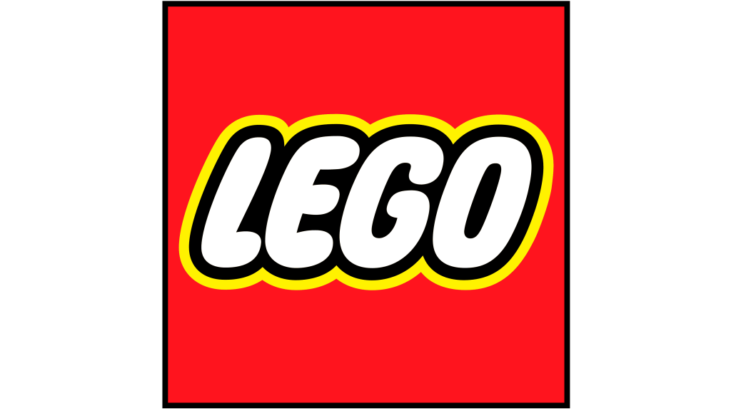

Red is a high-energy colour often associated with excitement and passion. It draws attention and can encourage action, making it ideal for brands that want to stand out and evoke a sense of urgency. It’s no wonder brands like Coca-Cola and Netflix use red to capture attention and convey excitement. However, too much red can also signify aggression, so it needs to be balanced carefully.
Blue: Trust, Calm, Reliability


Blue is one of the most universally liked colours and is often associated with trust, calmness, and reliability. In fact, The Colour Blue Effect study by the University of British Columbia found that people feel more creative and calm when exposed to blue hues. This makes blue a popular choice for financial services, healthcare, and technology brands—industries where trust and stability are key.
Yellow: Optimism, Warmth, Happiness
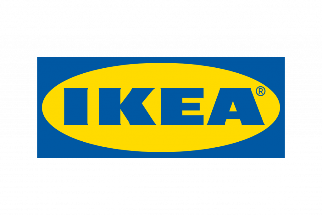


Yellow is the colour of optimism and cheerfulness. Brands like IKEA and McDonald’s use yellow to create a sense of warmth and friendliness. However, yellow can also cause visual fatigue if overused, so it’s often paired with other colours to strike the right balance.
Green: Health, Growth, Serenity


Green is associated with nature, growth, and health, making it perfect for eco-friendly or health-conscious brands. Companies like Whole Foods and Tropicana use green to emphasise their natural and organic focus. From an evolutionary perspective, green is calming because it signals abundant resources, which is why it’s also commonly used in brands promoting relaxation or wellness.
Purple: Luxury, Creativity, and Spirituality
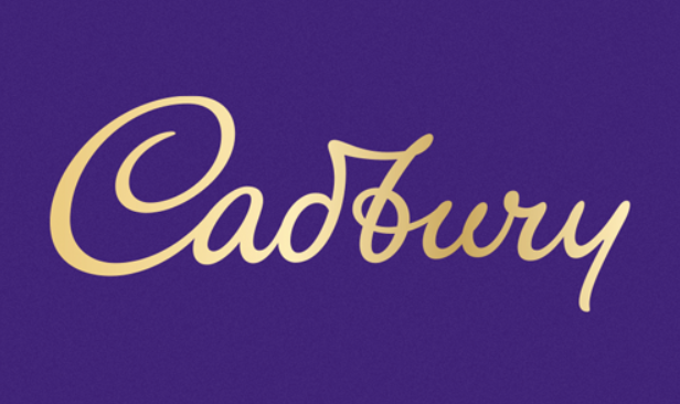

Purple has long been associated with royalty, luxury, and spirituality, dating back to ancient times when purple dye was rare and expensive. From an evolutionary perspective, purple is less common in nature, which may explain why it carries a sense of uniqueness and exclusivity. Today, brands like Cadbury and Hallmark use purple to convey creativity, quality, and sophistication. Purple is also linked to introspection and wisdom, making it a popular choice for brands in the luxury or creative industries, where uniqueness and depth of thought are important to the brand identity.
Orange: Enthusiasm, Energy, and Playfulness

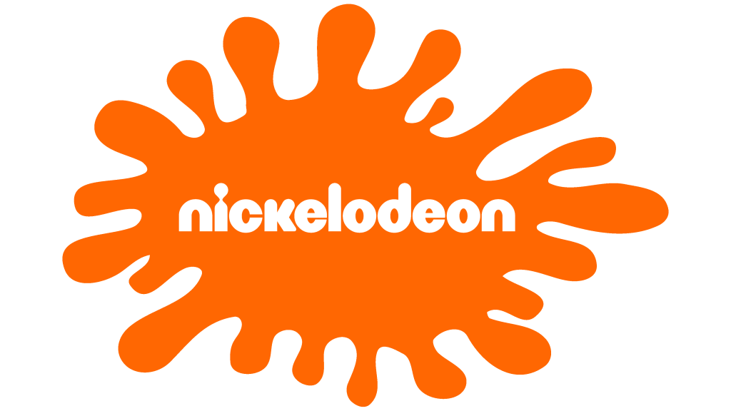
Orange is a warm, energetic colour that combines the excitement of red with the friendliness of yellow. Evolutionarily, orange is linked to fire and warmth, which can signal both excitement and vitality. Brands like Fanta and Nickelodeon use orange to create a sense of fun, energy, and approachability. It’s often used to appeal to younger audiences or in industries focused on entertainment, creativity, or innovation. However, orange can also convey caution if used in certain contexts, so it’s important to use this colour thoughtfully depending on the brand message you want to communicate.
Black: Luxury, Power, Sophistication
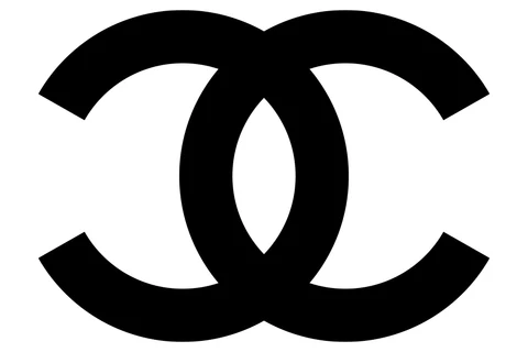


Black is synonymous with luxury and sophistication. High-end brands like Chanel and Louis Vuitton frequently use black to convey exclusivity and elegance. According to The Darkness Heuristic from cognitive psychology, people tend to associate darker colours with seriousness and quality, making black an ideal choice for premium products.
The Cultural Context of Colour
While colour psychology has some universal elements, cultural differences also play a significant role in how colours are perceived. For example, in Western cultures, white is associated with purity and cleanliness, which is why it’s often used in weddings or healthcare branding. However, in many Eastern cultures, white is linked to mourning and funerals. As a designer, it’s important to be aware of these cultural nuances, especially if your brand is targeting a global audience.
Building a Consistent Colour Strategy
To make the most of colour psychology in branding, consistency is key. Once you’ve selected your brand’s colours, use them consistently across all touchpoints—your website, social media, packaging, and advertising. Consistency Theory in psychology suggests that people prefer things that are predictable and familiar, which is why consistent colour usage reinforces brand identity and builds trust over time.
It’s also important to consider how your colours will appear across different mediums. Colours can look very different on a screen versus in print, so testing and adjusting for various formats is essential to maintaining brand consistency.
Conclusion
Colour psychology is a critical component of brand design that goes far beyond aesthetics. By understanding how colours affect emotions, perceptions, and behaviour, designers can create brands that resonate on a deeper level with their audience. From fostering trust to encouraging action, the right colour choices can influence everything from first impressions to purchasing decisions. Whether you’re building a new brand or refining an existing one, make sure to tap into the power of colour psychology to create a visual identity that truly speaks to your audience.